Hi there, I'm
Claire Nguyen,
a Technical Writer
with a background in UX design, front end development, and software engineering.
What that means:
- The end user is always at the forefront of my mind when I'm designing and creating documentation. This ensures accessibility, clarity, and consistency.
- My software documentation is structured and built from a developer's perspective, allowing me to tailor content for technical audiences accordingly.
- I can seamlessly work and collaborate with various kinds of cross-functional teams.

Who am I?
My name is Claire, and I'm really big on clear, comprehensive, and user-centered content and documentation. I'm currently a Software Technical Writer at Panasonic Avionics and am based in Southern California.
When it comes to writing documentation, I don't approach it in a vacuum. In addition to translating the complex stuff into refined information, I heavily take the end user into consideration. I provide experiences that help readers navigate information easily, and I organize things in a logical and coherent way. My background in UX/UI design and front end development have been integral in informing my work in this domain.
You may have noticed hints of flan around my portfolio. That's because I'm a big flan fan! When I'm not writing or designing, I'm finding ways to improve my flan recipe. There are many kinds out there, but my favorite is Japanese purin (ask for my recipe!). You can also find me 3D printing on my Prusa CORE One or reading fiction novels on my Kobo.

Latest technical writing experience

Panasonic Avionics
Software Technical Writer
I published 130+ technical documents that airline customers and internal developers use to navigate software products, including user guides, developer guides, and API references.
Additionally, I spearheaded the use of docs-as-code workflows, including a custom Pandoc-based toolchain to produce HTML and PDF documents, and a MkDocs-based documentation site template adopted across several software products.
Skills

BrettOps
UI Developer and Technical Writer
At BrettOps, I produced internal guides for software installation and configuration procedures, edited corporate blog articles geared for technical audiences, and drafted content for company newsletter emails.
Additionally, I designed and developed the corporate website and company slideshow template and ensured user-friendliness, responsiveness, and accessibility.
Skills

Some samples of my writing
The following are some publicly available samples of my writing work.
User Guide
Setting up a new GitLab project on a new machine
There are so many ways to start a project on GitLab, and there are so many guides and articles to follow. However, I've yet to find a comprehensive guide that walks through my way of setting things up within this particular situation.
Since this isn't something I do every week, I wrote this guide so that I'm able to repeat the steps in the future.

User guide
Building a static site with Eleventy and Tailwind
There are many different tools out there for creating websites, and there is no shortage of guides for static site generators. If you're looking to use Eleventy and Tailwind for your site, look no further.
I co-authored this guide that talks about getting the two tools to work together for static site generation.
Case study
Tackling large party reservation problems
Just like group projects back in school, making reservations for a large group can get complicated pretty quickly. Different people have different food preferences with different schedules and different lives, and the more people there are, the more complex it gets.
This case study details how I designed a responsive reservations website that focuses on helping users who are looking to make reservations for a large group of people and help them quickly resolve matters that would normally come up in this situation.
Case study
Reducing food waste in the home
Did you know that 76 billion pounds of food are wasted every year in the United States, and that's just from households alone? I found that a lot of it has to do with forgetfulness and lack of visibility and inspiration when it comes to maintaining a mental record of the available foods at home.
This case study goes through Food Time!, a mobile app that I designed for keeping track of food at home and finding recipes to help reduce food waste.
Case study
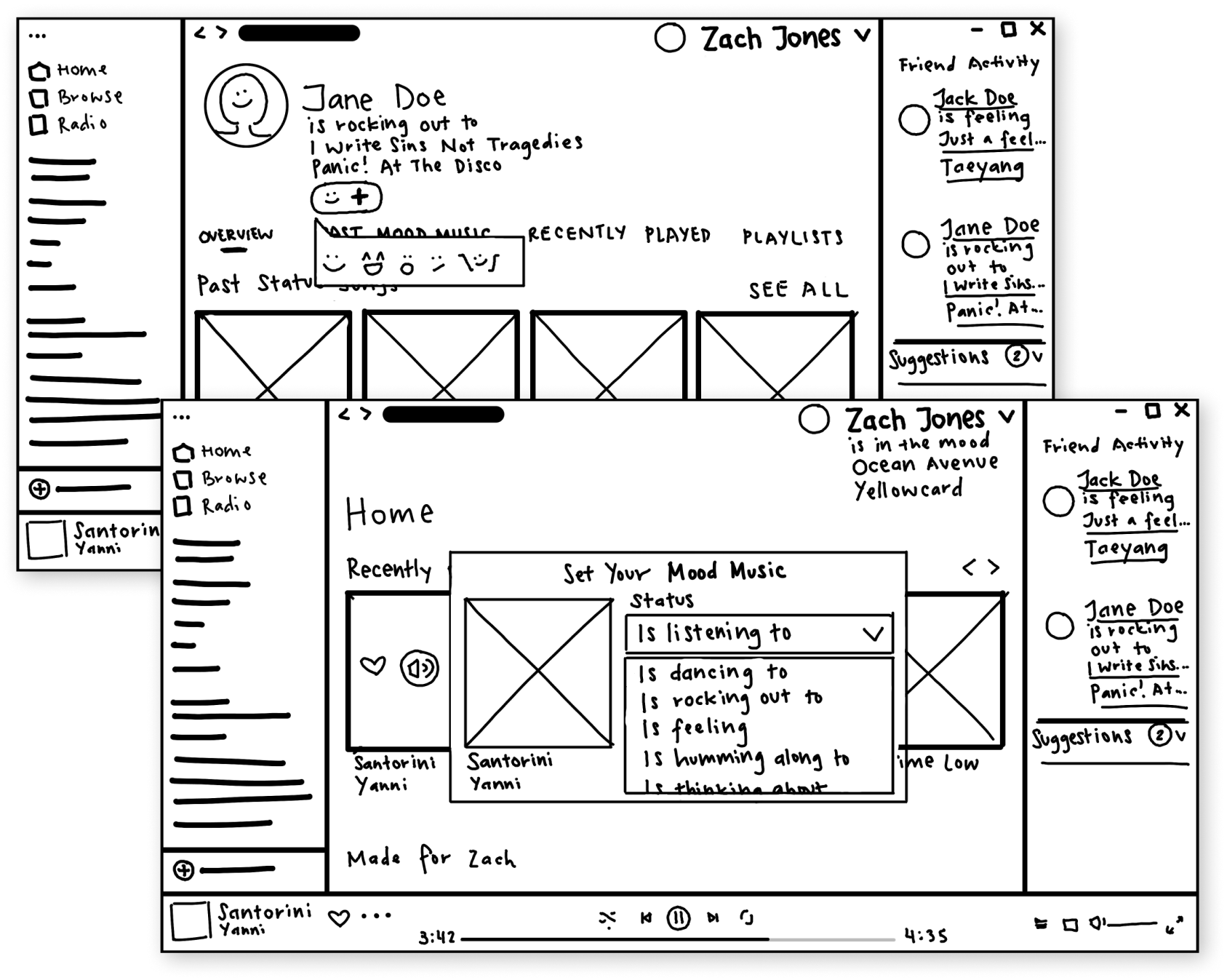
Encouraging social connections in Spotify
Music is a very powerful aspect in people's lives, and when it comes to sharing one's taste in music, the simple action surprisingly gets very intimate and emotionally complex.
This case study walks through a Spotify feature I designed that helps build and boost connections between friends and family by easing the emotions of sharing.
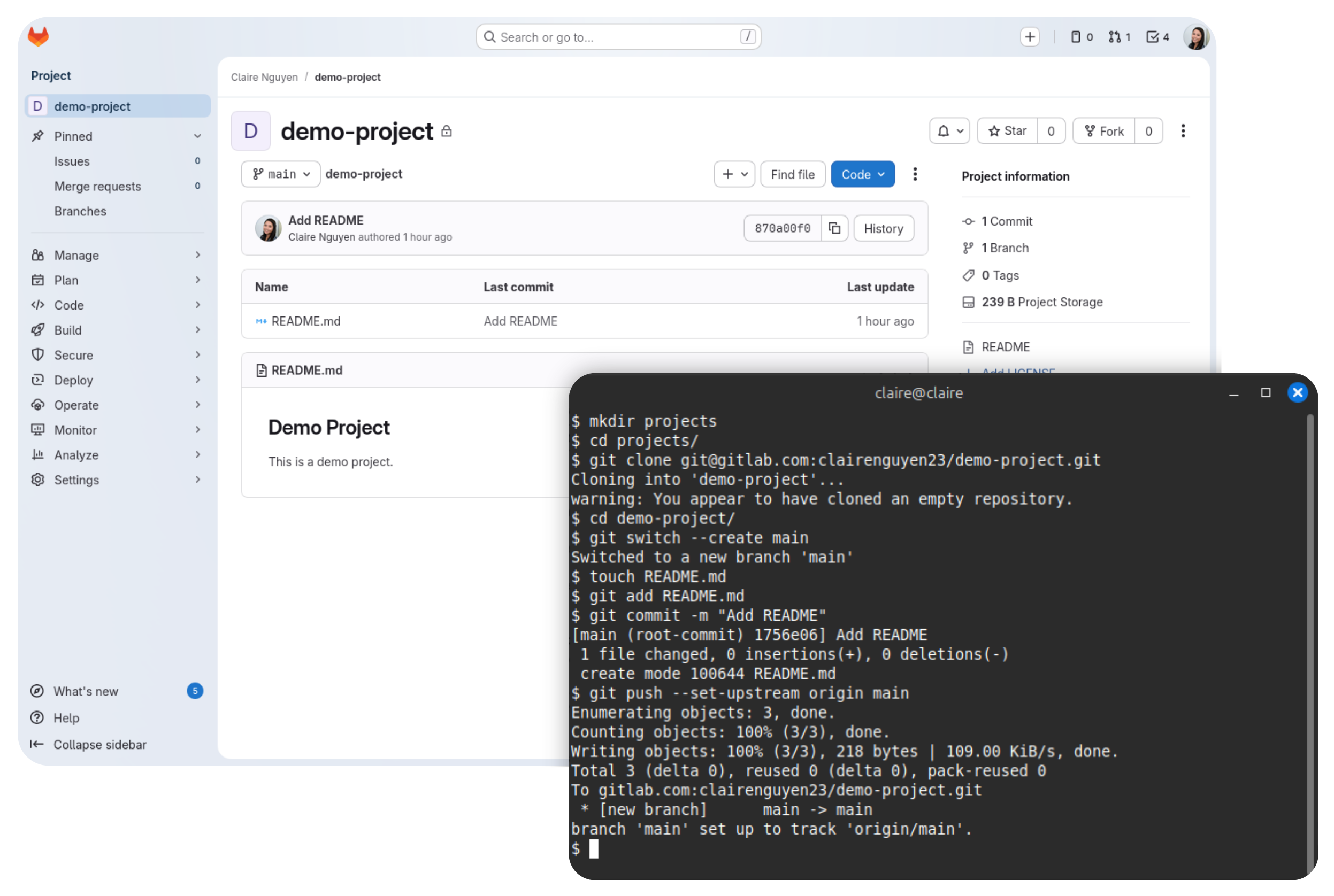
Setting up a new GitLab project on a new machine

This guide walks you through setting up a new GitLab project on a new or recently reformatted machine, from creating a blank project to pushing your first commit.
Requirements
You'll need the following:
-
A Linux machine. If you're using a Windows computer, you can install WSL.
-
Git installed on your machine.
It is also recommended that you have Visual Studio Code installed on your machine.
Create a GitLab project
This section provides instructions for creating a GitLab project via the web UI.
To create a GitLab project:
-
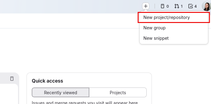
In GitLab, select the + icon at the top, then select New project/repository.
-
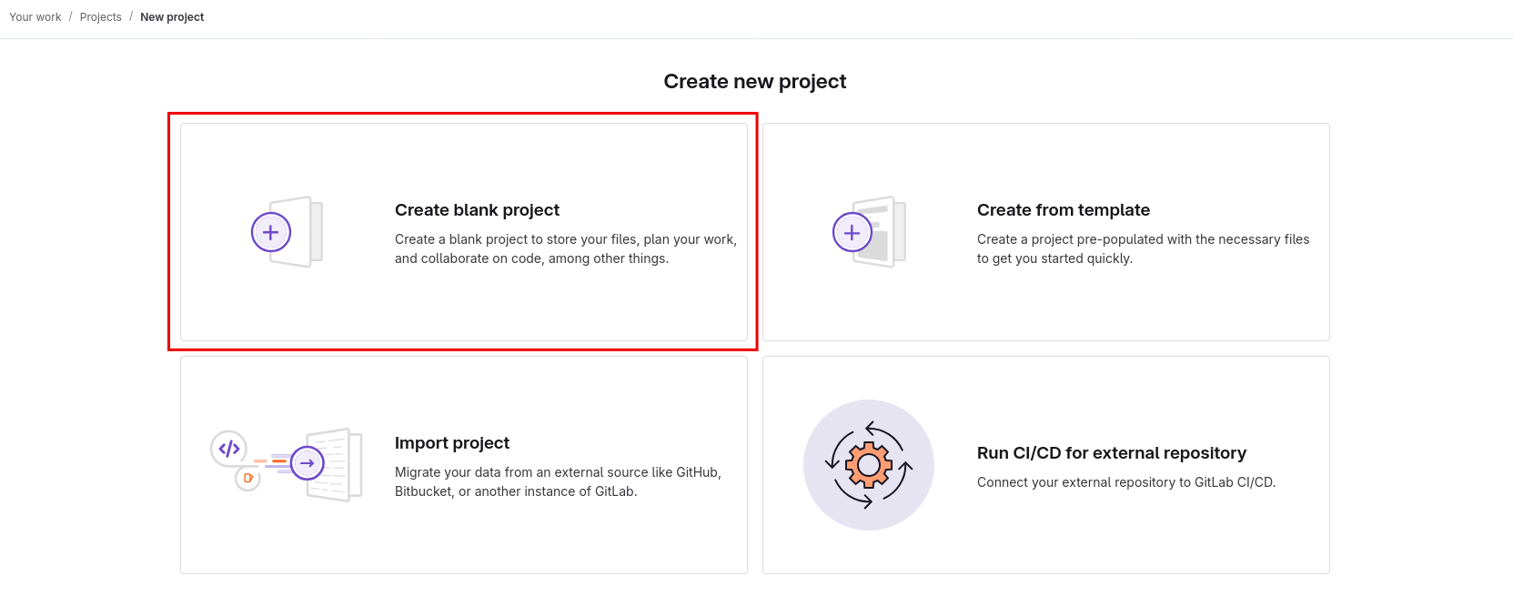
On the Create new project page, select Create blank project. We'll start this project from a completely blank slate.
-
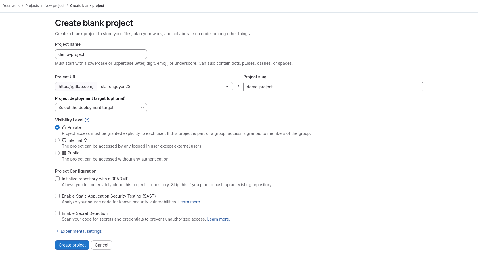
On the Create blank project page, enter the following information:
-
Project name — Add a unique project name.
-
Project URL — Select a workspace. For personal projects, select your user account.
-
Project slug — You can keep the auto-generated slug or enter a custom one.
-
Visibility level — You can keep the default Private option selected or select another level.
-
Project configuration — Unselect the default Initialize repository with a README option and keep all other options unselected. We'll initialize the project locally.
-
-
Select Create project.
Your new GitLab project is now created.
Configure your Git identity on your machine
To work on your project on your machine, you'll need to configure your Git identity.
The following instructions configure your Git identity globally so that all commits you make across all projects on your machine on your current user account will have this configuration by default.
-
Open a terminal.
-
In the terminal, configure your user email globally by doing the following.
git config --global user.email "[email protected]" -
Configure your user name globally by doing the following:
git config --global user.name "Your Name"
Your Git identity is now configured.
Set up SSH
Setting up SSH allows you to securely connect to GitLab using the SSH protocol instead of HTTPS so that you don't need to authenticate with your username and password every time you do anything with GitLab, such as cloning a project. You only need to do this setup once for every desktop user account in which you are working on a project.
This guide walks you through setting up SSH on your machine with GitLab using the ED25519 algorithm, which is GitLab's preferred algorithm.
To set up SSH:
-
Open a terminal and run the following.
ssh-keygen -t ed25519This outputs the following:
Generating public/private ed25519 key pair. Enter file in which to save the key (/home/user/.ssh/id_ed25519): -
You are then prompted to accept the filename and directory in which the SSH key will be saved. Press Enter.
-
You will then be prompted to enter a passphrase. You can leave this empty by pressing Enter, then pressing Enter a second time.
Enter passphrase (empty for no passphrase):
Enter same passphrase again:
This then generates your public and private SSH key. The console output will look similar to the following:
$ ssh-keygen -t ed25519 Generating public/private ed25519 key pair. Enter file in which to save the key (/home/user/.ssh/id_ed25519): Created directory '/home/user/.ssh'. Enter passphrase (empty for no passphrase): Enter same passphrase again: Your identification has been saved in /home/user/.ssh/id_ed25519 Your public key has been saved in /home/user/.ssh/id_ed25519.pub The key fingerprint is: SHA256:mBQ5SFl8hRuR5IXutgjRPVPwGtI5WD0s6fKOh+NNNEE user@desktop The key's randomart image is: +--[ED25519 256]--+ | ..=ooE@o | | o +BO+= | | .+*B=.. | | ..o+B= | | .o+So | | . .+. | | . *.. | | =o+ | | ..o. | +----[SHA256]-----+ -
Print your public SSH key by doing the following.
cat /home/user/.ssh/id_ed25519.pubThis will output something similar to the following:
ssh-ed25519 AABC123DEF456+/zyxwvut321 user@desktop -
Copy the entire printed string of your public key to your clipboard.
Note: Do not share your private key with anyone.
-
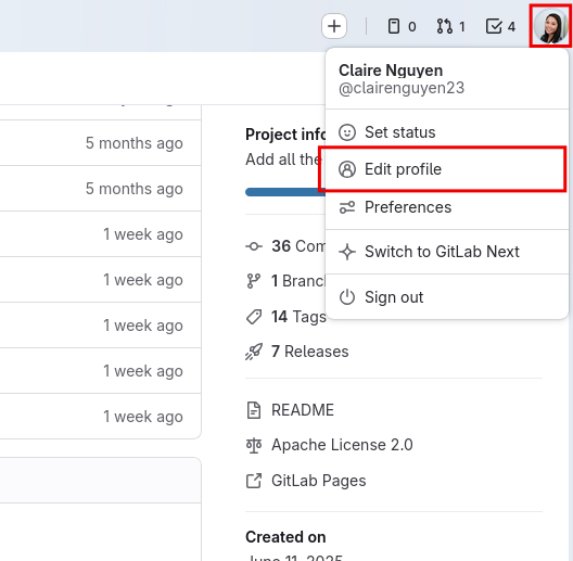
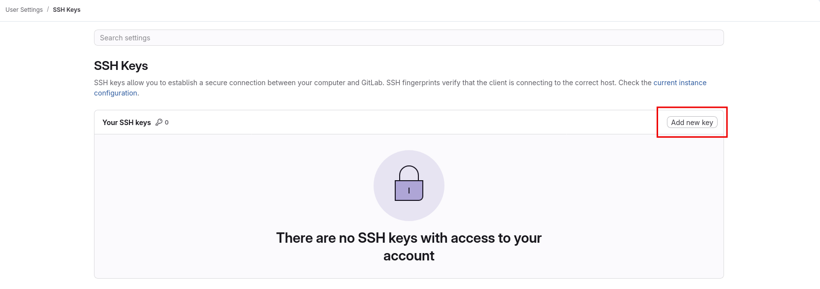
In GitLab, select your account icon, then select Edit Profile.
-
In the User Settings left navigation menu, select SSH Keys.
-
On the SSH Keys page, select Add new key.
-
On the Add an SSH key page, do the following:
-
In the Key text field, paste the public SSH key you previously copied.
-
You can leave the default title that the UI provides, or you can add a custom one.
-
Remove the expiration date.
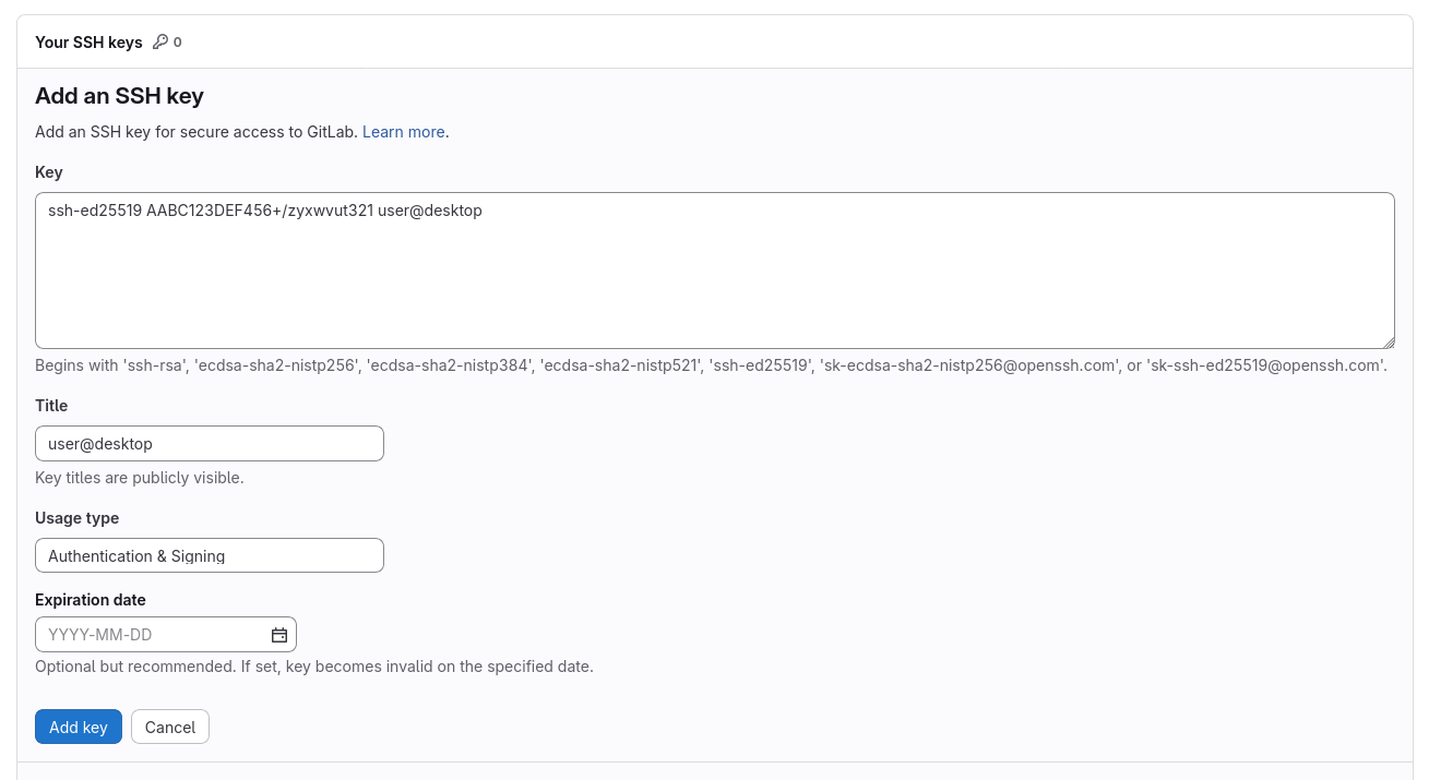
-
-
Select Add key. This adds your public SSH key.
You can now use the SSH protocol to interface with GitLab using the Git CLI.
Clone your project
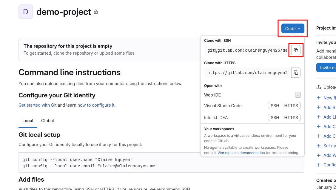
To clone your project to your machine:
-
Navigate to your project on GitLab.
-
On the project page, copy the Git SSH URL by selecting the Code dropdown, then selecting the copy button next to the Git SSH URL under Clone with SSH.
-
Open a terminal and navigate to a directory where you want to clone the project.
cd projects/ -
Use the
git clonecommand with the SSH URL you just copied to clone the project into your current directory.git clone [email protected]:clairenguyen23/demo-project.gitWhen cloning a project for the first time, you'll encounter the following prompt:
$ git clone [email protected]:clairenguyen23/demo-project.git
Cloning into 'demo-project'...
The authenticity of host 'gitlab.com (172.65.251.78)' can't be established.
ED25519 key fingerprint is SHA256:eUXGGm1YGsMAS7vkcx6JOJdOGHPem5gQp4taiCfCLB8.
This key is not known by any other names.
Are you sure you want to continue connecting (yes/no/[fingerprint])?
Enter
yes, then press Enter.
You now have your project cloned on your machine.
Configure your project
To configure your project:
-
Navigate to your project's directory.
cd demo-project -
Create a
mainbranch and switch to it.git switch --create mainThis outputs the following:
$ git switch --create main Switched to a new branch `main` -
Create an empty README.
touch README.md -
Stage the newly created README.
git add README.md -
Commit your staged changes. This comprises of the README you created.
git commit -m "Add README"This outputs the following:
$ git commit -m "Add README" [main (root-commit) a12b34c] Add README 1 file changed, 0 insertions(+), 0 deletions(-) create mode 100644 README.md -
Push the commit to your project. The
--set-upstream origin mainflag is only necessary when pushing for the first time to a project.git push --set-upstream origin mainThis outputs the following:
$ git push --set-upstream origin main
Enumerating objects: 3, done.
Counting objects: 100% (3/3), done.
Writing objects: 100% (3/3), 217 bytes | 217.00 KiB/s, done.
Total 3 (delta 0), reused 0 (delta 0), pack-reused 0
To gitlab.com:clairenguyen23/demo-project.git
* [new branch]      main -> main
branch 'main' set up to track 'origin/main'.
Your project is now configured on your machine.
Next steps
You've just created a GitLab project and configured your project locally for work. You're now ready to write some code!
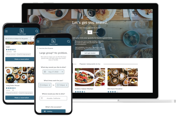
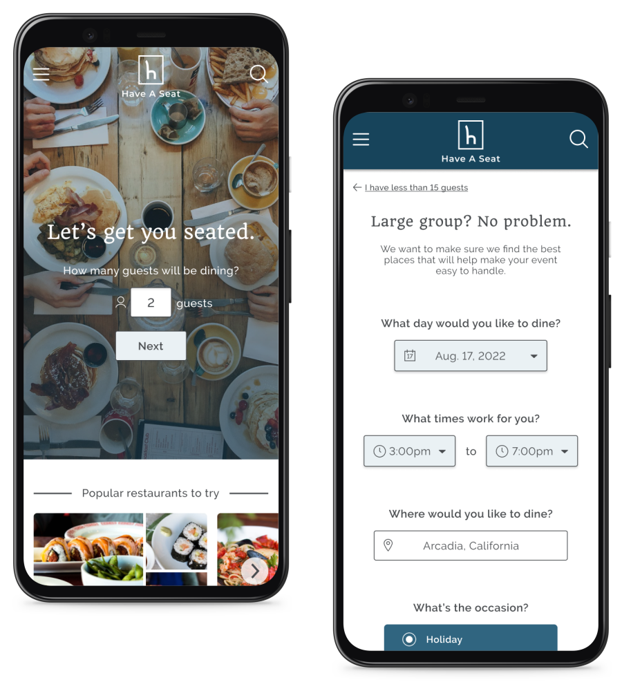
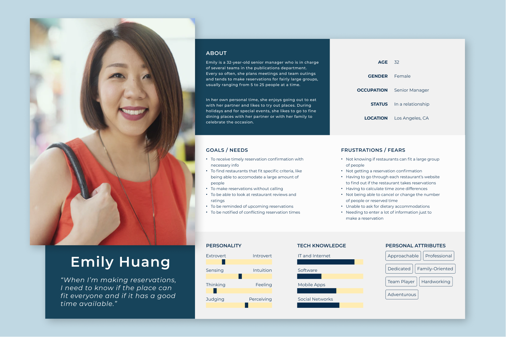
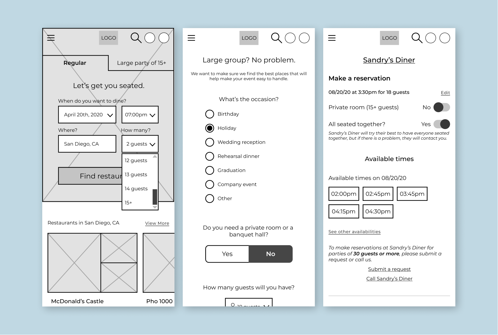
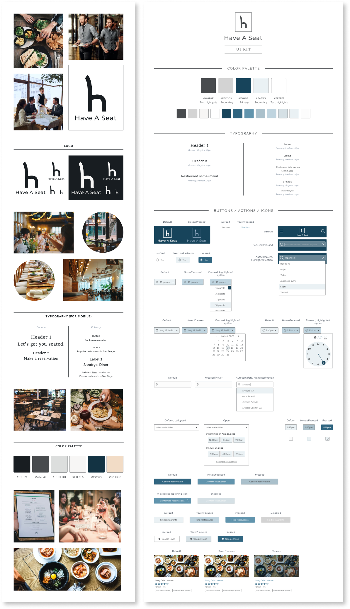
Tackling large party reservation problems
UI/UX Designer and Writer | Research, Wireframing, Usability Testing, Design, Prototyping | 90+ hours
Group projects—everyone's been part of one.
The biggest challenge is always about working together, because everyone has different...everything. Different opinions, ideas, working hours, etc.
Making reservations for a large group is no different. Different food preferences, availabilities, budgets, etc. And the more people there are, the more complex things can quickly get.
Why would things get complex with more people?
According to my research with users:
"I had to find a place that could seat all 20 of us, but it was so hard to find any!"
Reservations for a few people tend to be straightforward. But for 15 people? 50? It gets messy pretty quickly. Users tend to search online for places, but it can be vague and confusing as to how many people a restaurant is able to take. In a lot of cases, users have to call up a lot of restaurants just to check and negotiate, which takes up their time and energy.
"I'd rather make reservations online than via calling."
For convenience, because many users are using the internet to search for and read up on places already, they usually want the next step—making reservations—to be online as well.
"I've constantly had to find places that were appropriate for company events for my company."
Not all restaurants are good for all types of occasions. Would you normally host a company dinner at the local Chuck E. Cheese? Would you celebrate a child's birthday at a famous winery? My guess in most cases—probably not.
When it comes to special events of some sort, people want to find places that suit the scene and the moment. For important corporate events, taking your staff to McDonald's might not be the best choice.
Here's how I tackled these issues
Graduation party with 35 relatives at 7pm? We got you.
First and foremost, my focus was taking away the hassle, complications, and frustrations of trying to make reservations for a large group of people. Instead of jumping through hoops, calling up every restaurant, and figuring out what restaurants are good for what, this takes care of it for you.
From the get-go, it knows when you've got a large group to take care of. From there, users can answer a few telling questions that would then show them the best restaurants for whatever occasion they have. These questions come from the concerns and frustrations users reported having when it comes to making reservations for large parties.
Found a restaurant? Check. Make a reservation? Check.
Once you find a restaurant that fits everything that you need for your group and event, you go straight through the reservation process. It's designed to be as straightforward as possible, asking only what is necessary from the user and nothing more.
Once that is done, everything is emailed to you, with clear instructions on how to change or cancel the reservation if needed. No guessing, no confusion, because it was all designed using user research.
Here's a peek at some of the work I did
Research was what led me to design specifically for large party reservations
There were the occasional common mishaps that users brought up during my research. For example, users mentioned not understanding the person at the restaurant when they called up the restaurant to make reservations—some due to bad signal, some due to a language barrier. It was a given that for those problems, in addition to users preferring to do things through the internet, the reservation process should be online.
But the heaviest of frustrations that always came up was when users needed to find reservations for some group outing. That was where I knew I wanted to focus my attention.
It was imperative to have a straightforward and simple user flow
The biggest frustrations were rooted in the complicated, messy process of making a reservation for a large amount of people. So that was where I needed to focus my energy.
The key was to help people go from deciding to eat at a restaurant, to actually having a seat at the restaurant, with as little obstacles as possible in between. If there is some occasion that's happening, then finding a place should be the least of their worries.
Wireframing, designing, and a lot of testing
As always, it was imperative to get the flow right, and I discovered very early on that my initial ideas weren't achieving that. It was only through wireframing and usability testing that I discovered how I wasn't getting it quite right, as well as nudges in the right direction while I was watching my users get frustrated at my first passes of the UI.
Getting past the clunky flow was difficult, but once I smoothed it out, users were all able to successfully make reservations quickly and easily.
And the glue that holds it all together: the branding and visuals
Conclusion
I started this project while the global pandemic was still happening, and at that time, going out to eat and making reservations wasn't as common quite yet. My inspiration to pursue this project started then, while thinking of the future when things would go back to normal. This gave me a slight disadvantage starting out, as my research with users leaned more towards recalling further past experiences rather than ones more recent.
However, users surprisingly had stronger memories about their past experiences. I found that it was because eating out was an activity that they enjoyed but weren't able to do as freely, and users yearned to do so hopefully soon again, which lead to stronger emotions and recollections.
So despite the fact that restaurant reservations were, at the time, a thing of the past, it didn't mean that I couldn't think ahead to the future on how useful restaurant reservations will be for when people will be able to gather to eat together again, especially to celebrate the efforts and success of overcoming the pandemic.
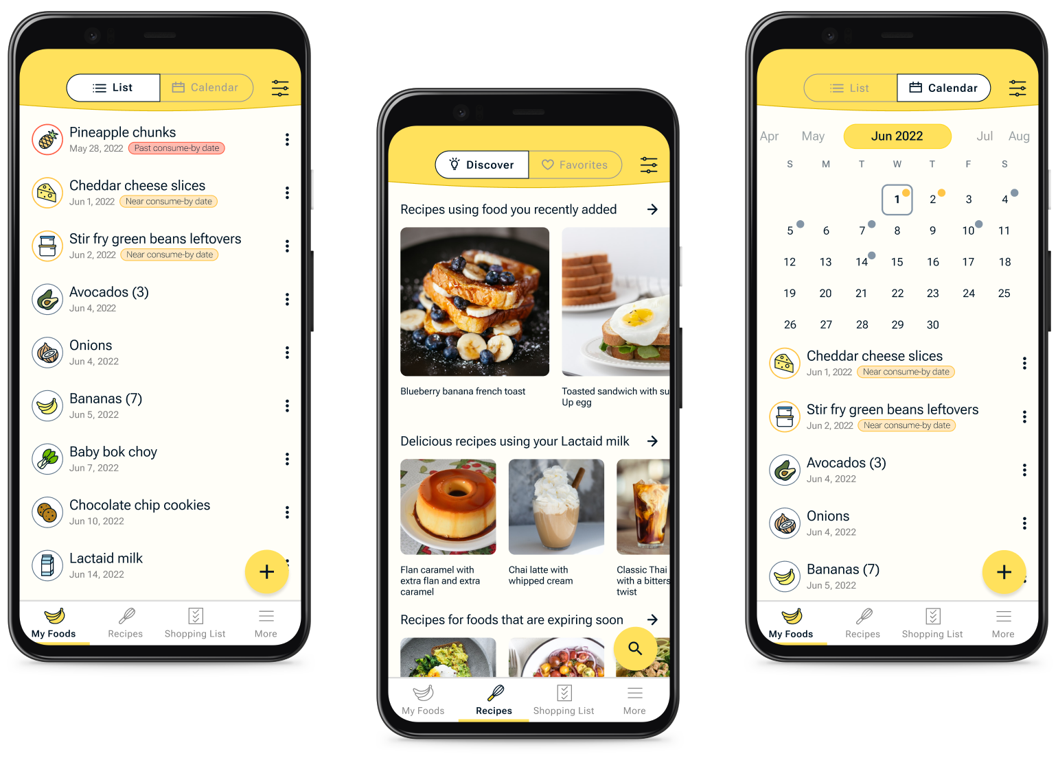
Reducing food waste in the home
UI/UX Designer and Writer | Research, Wireframing, Design, Prototyping, Usability Testing | 100+ hours
76 billion pounds of food are wasted every year in the United States, coming from households alone.
It's a pretty big problem, and it has a lot to do with the relationship that people have with the food they have at home—a relationship that could use some work.
So what do I mean when I say, a relationship that could use some work?
According to my research on domestic food waste and through user interviews:
"Out of sight, out of mind...out of time."
When people don't see a food item, they tend to forget about it—right up until they discover it again much too late where it usually goes straight into the trash.
"I got this bit of jam left... but no bread or peanut butter."
What happens when users have a small amount of an ingredient left and don't know what to do with it? For example, like that that thin layer of jelly at the bottom of the jam jar. It would be enough for a sandwich...if they had bread and peanut butter.
What usually happens with leftover ingredients is, users don't know what to do with it and they end up tossing the foods out.
"The date on this says to eat it by yesterday, but I forgot to. Can't eat it now."
The interpretation of date labels varied among users. Some users don't abide by date labels on food and, instead, smell or taste check to decide if the food was still good. However, I found that many users tend to hold steadfast by the date label on the food, no matter what, which usually ends with the food prematurely going into the trash.
Here's how I handled these issues
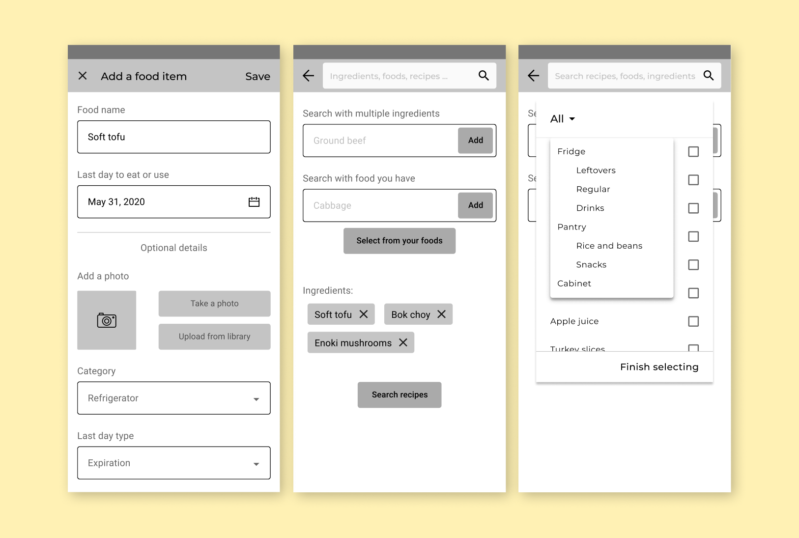
Food tracking, expiration date setting, and reminder alerts
Users can add their foods into the app—groceries, ingredients, leftovers—and have it accessible at any time, whether they're at home standing in the kitchen and trying to decide what foods to make or eat, or at the grocery store trying to remember if they were out of milk or not.
Users can set a "consume by" date for each food. Because users have different interpretations of date labels printed on foods and because foods like fruits and vegetables don't usually have date labels, this date depends on user and their own system of "still good to eat" time periods.
In addition, to help users avoid losing track of when they want to use or eat their foods, users can turn on alerts for food items they want to be reminded to eat.
Searching for recipes that use food available at home
To tackle the problem of having extra or leftover foods and not knowing what to do with them, recipes are a good way to go. But instead of just providing the millions of recipes out there, I added a feature that searches for recipes by searching with foods you already have.
That bit of jam you have left? Well, you don't have to stop at just PB&J. You can mix it in with your yogurt or cereal, or use it to top off pancakes and desserts!
Got a few slices of bread, but run out of mayonnaise or turkey slices to make a sandwich? Try eggy-in-a-basket! It's delicious, and nutritious!
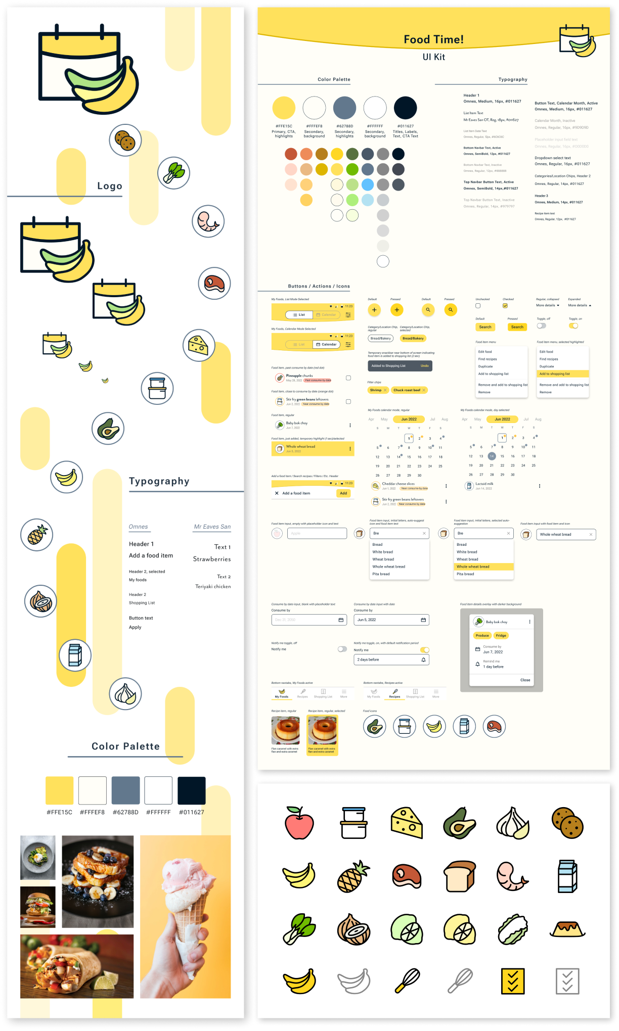
Here's a glance at some of the work I did
Empathizing was key in all my design decisions
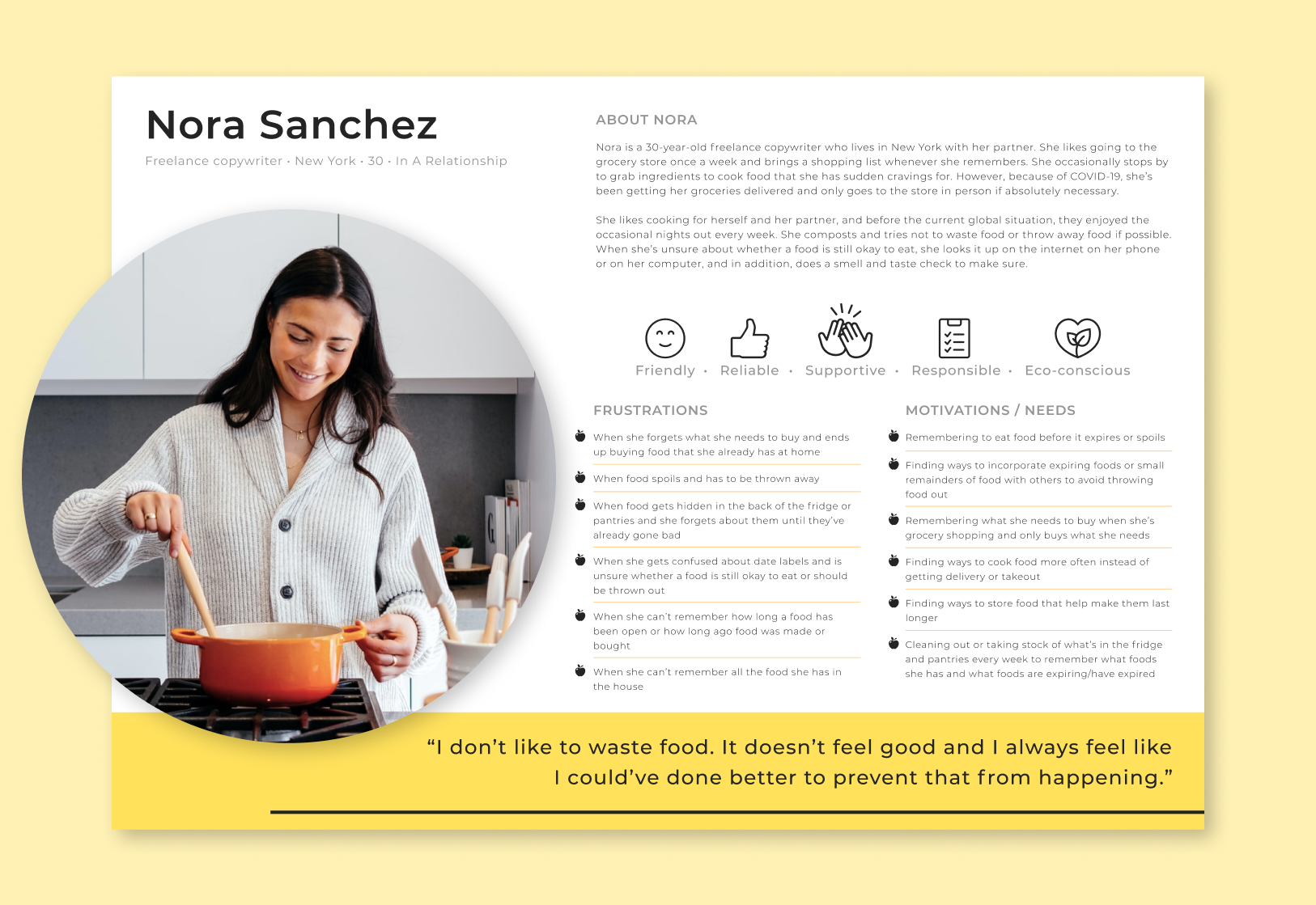
I knew I needed to make sure I was designing for the right user. Because I felt like I was one of the users, one of the biggest hurdles was removing myself from the problem.
Focusing on problems that other people actually had was important, and empathizing helped immensely. Even just going through empathy mapping and creating a persona helped me push past my own biases.
Rapid ideation, for the win
It was important for me to find the best ways to tackle the pain points that users were having. Crazy Eights brought out not just one good idea, but a few equally good ideas that I couldn't resist going forward with.
And from there, rapid storyboarding was the way to go, as it was imperative to make it as easy as possible for the user to reach the end goal—reduce throwing out food.
Wireframing, designing, iterating...and testing, testing, testing
I found that copy was important to users, especially when it came to the terms/phrases that would indicate when a food is going to expire or go bad.
Terms like "expiring foods" were quickly thrown out after testing the first time around—it wasn't flexible enough and was too similar to hard date labels. "Last day to eat or use"—too confusing. So I spent a lot of time deliberating on words, but it proved to be time well spent after getting much more positive feedback later on in my usability testing.
The recipe searching was tricky at first, but in the end, it was the most satisfying to design.
The goal of the feature was for users to easily search for recipes with food and ingredients they've added to the app. My first iteration was a flop, with no users being able to complete the recipe searching task. But this is why I love testing as early and as much as possible.
After gathering everyone's insights and frustrations in that first round, I changed the flow completely. By the next round of testing, 100% of all users were able to easily complete the task.
And? Making it look and feel awesome
Conclusion
One of the ideas I originally had while ideating was having a way to recommend users on how they should interpret date labels and how they can determine if a food is still safe to eat, despite what the labels may say. However, I quickly realized that to pursue that, I'd have to find a health/food expert in order to safely recommend that kind of information. Maybe someday in the future, I'll have the resources to pursue this!
Looking back, this project was not only fun, but also made me push my limits in both ensuring the ease of use and the visual aesthetics. While it was initially a struggle to remove myself from being one of my users, the end product was entirely worth it and completely user-centered.
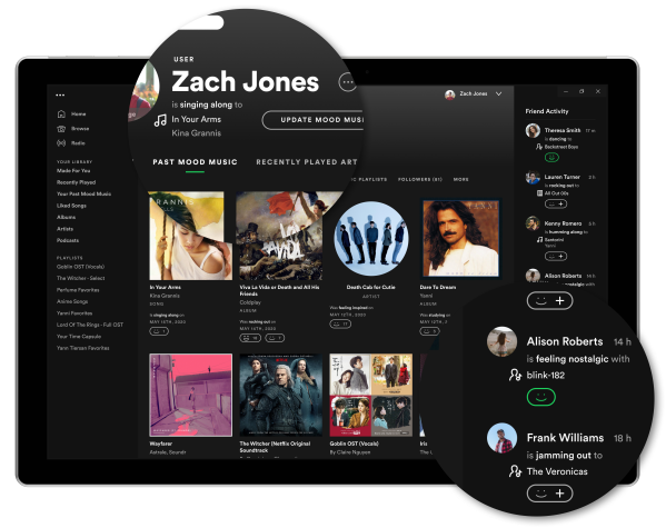
Encouraging social connections in Spotify
UX Designer | Research, Wireframing, UX Design, Prototyping, Usability Testing | 100+ hours
Sharing music. Sounds straightforward right?
Well, not quite.
The process is arguably straightforward. But when human emotions come into play, it gets complicated pretty quickly.
Why would sharing music be complicated at all?
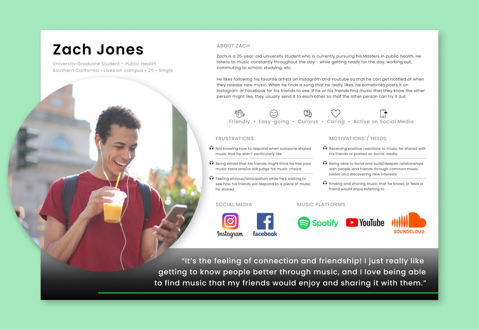
After a few rounds of user interviews, I found:
"Sharing music is very intimate. It's like sharing a big piece of me with someone."
People constantly expressed that sharing music is a vulnerable activity. To users, it's like they're revealing a special part of themselves that's usually hidden away for when they're alone. When an outside person doesn't like the music that a user shared, it's almost like that person doesn't like the user. Rejection is scary.
"My friend shared a song with me that I liked, and I felt closer to her because it's like she gets me."
Being understood is one of the most incredible aspects in relationships. When music comes into play, it adds a level of complexity. It's not just about understanding words being exchanged anymore. It's also about understanding how a person is tied to the music they enjoy, and it's a powerful feeling when someone gets it.
"I didn't like this song that he shared...but I didn't want to hurt his feelings."
Sharing music is basically sharing a part of yourself. So when users are faced with this action from someone else—someone who is sharing a piece of themselves, but it's with music the user doesn't enjoy—the user gets stuck. They don't want to hurt the person's feelings because they know it's a sensitive matter.
This was how I approached the music-intimacy complexity
Sharing music that you love...
There's a strong connection when you find that a friend likes the same music that you do. It's like discovering a piece of yourself in them, and when you do, it's a wonderful feeling.
But what about the potential rejection—someone not liking your music?
Well, why do people still date and seek out companionship, despite the past and potential future heartbreaks? It's because the feeling of a possible connection with another person tends to overpower that fear.
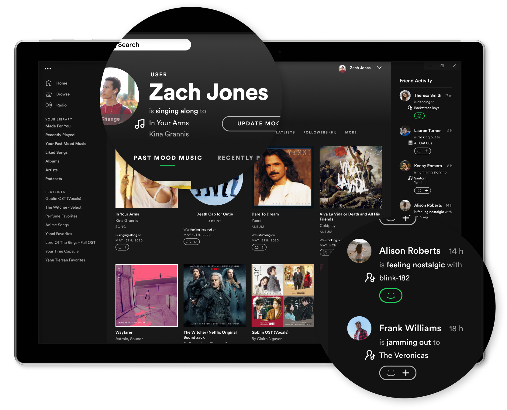
All my users mentioned enjoying the ability to share their music on social media. In one user's words, it was like "casting a net" to see who would respond positively.
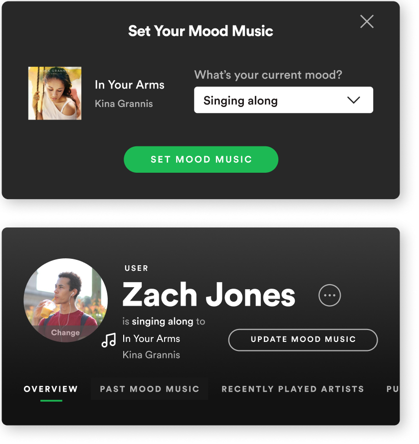
It was exactly the direction that fit the bill, and it was the first part of my design implementation. This feature lets users cast to the world the music they loved, in hopes of finding others who feel the same way, directly on the music platform they regularly use.
...and finding out who loves it like you do.
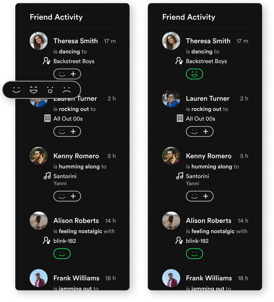
So how does a user know if their net caught anything—aka, if anyone else also enjoys the music they posted?
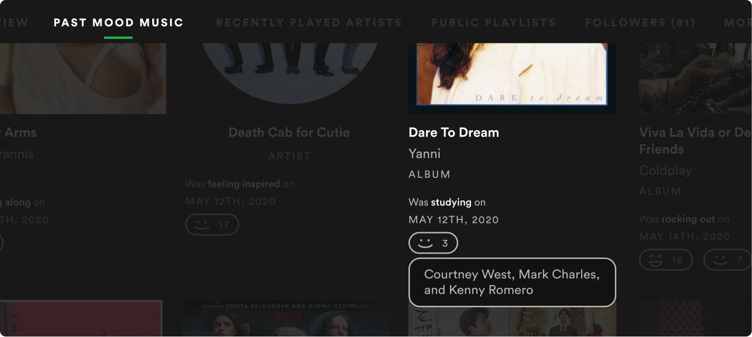
My design: through simple reactions. Similar to social media "likes", people can react to posted songs to let the poster know that they enjoy the music as well. With this, users can tell who might have similar music tastes as them.
The magic in all this? It's just a simple reaction...or not. If a user doesn't particularly enjoy a friend's posted music, they don't have to go through the emotions of rejecting a person's music. They could just choose not to react at all.
That's the goal of this feature—to ease the heartbreak and frustration of giving and receiving rejection.
Here's a glance at some of the work I did
Research, empathize, and research again
One round of research was not enough. There was so much that my users talked about that I wasn't able to contain it all in the 30 minutes I had set aside for each interview. The goal was to improve the music-sharing process, and, initially, I had thought I'd just be adding a straightforward sharing function.
But after hearing the emotional aspects of sharing music from my users, I couldn't help but go through another round of research to dive deeper into that fascinating area. And it was worth it.
Crazy, rapid ideating...like crazy
Ideating was hard for this project. What was I supposed to design when it came to creating not just a good experience, but one where it would address the vulnerability of sharing a piece of themselves?
Crazy Eights and rapid storyboarding were the answers, and it was indeed both crazy and rapid. I went through so many ideas and flows and rounds that it seemed endless. But it proved be just what I needed.
And a ton of sketching and testing
Conclusion
I learned a lot about how users feel when sharing a piece of themselves through music, and, in a way, how they are opening themselves up to others in an effort to connect and deepen relationships.
What ultimately makes users hesitate before sharing music, or deciding against it altogether, is the anxiety of not knowing if the other person will reject this part of themselves. And on the opposite end, what makes users open themselves up is when they receive positive reactions and responses to music they shared.
It doesn't end there: many other emotions come into play, depending on what music comes on for users. For instance, a user mentioned that sometimes, the music they listen to triggers past memories...in an oddly complicated, but good way.
Moving forward, this is something that I would definitely spend more time on in the future, as I feel there are many ways of enhancing the experience of sharing and being shared music.
